Myblue 2 - Member Portal Redesign

  • Stabilized directionless project — re-engaged stakeholders and delivered complete redesign and development
  • User-based IA achieved 93% better task completion than stakeholder design—established UX credibility
  • Increased satisfaction from 2.6/5 to 3.2/5, traffic by 50%, and reduced coverage calls by 20%
  • Discovered "politeness gap": Members rated portal 3.5/5 in-person but 2.6/5 in-product
Overview

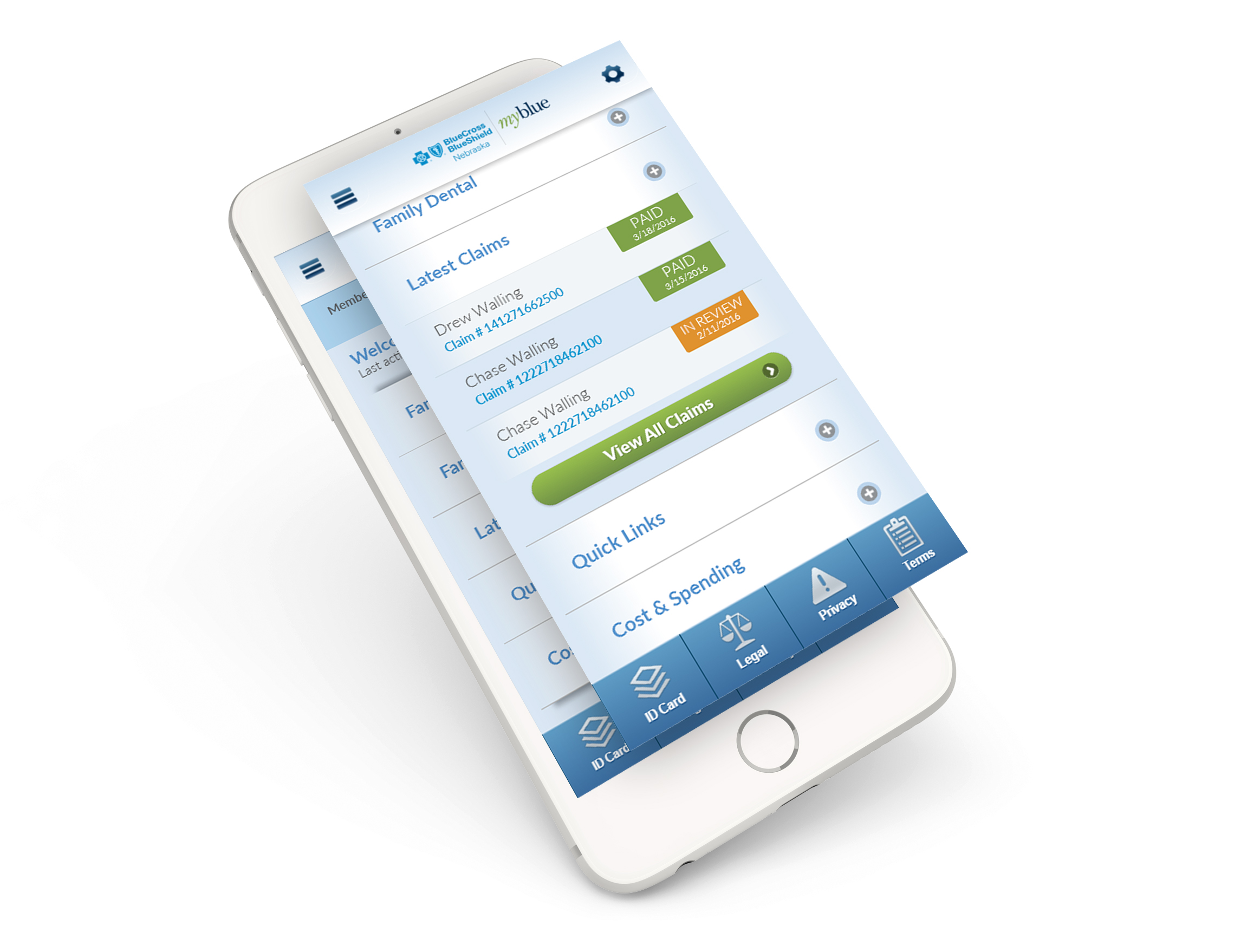
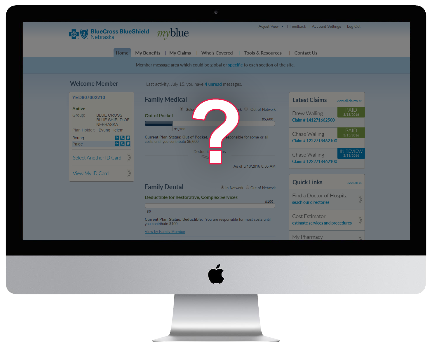
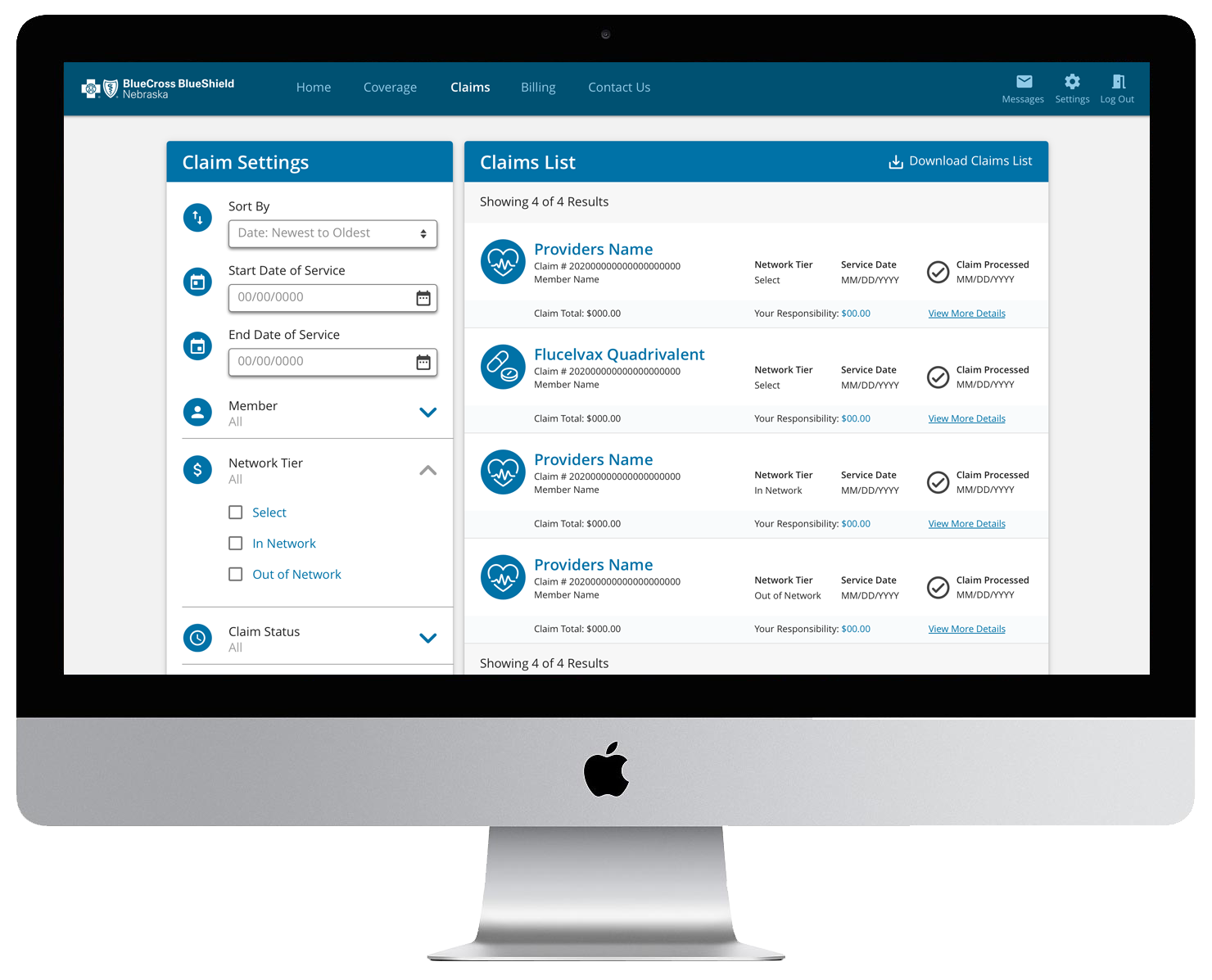
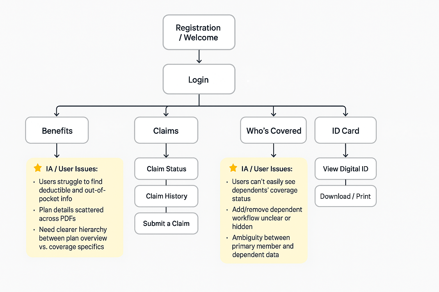
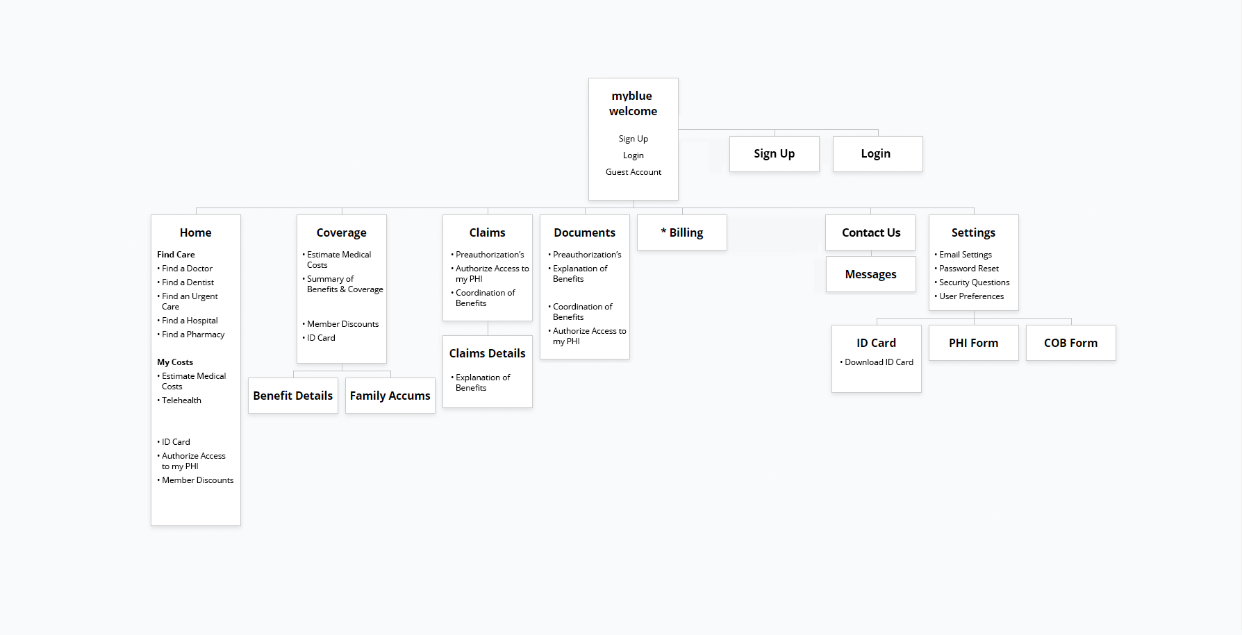
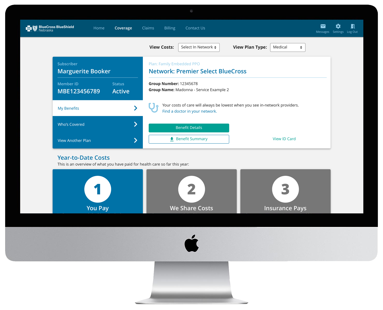
In 2020, I was brought in to rescue a struggling member portal redesign that had lost both original designers, the Product Owner, and multiple developers during a company restructure. With no stakeholder alignment, incomplete UX research, and a neglected application suffering from poor usability, I stabilized the initiative, re-engaged leadership, and led a complete redesign from research through launch.

Over two years, I transformed a portal with a 2.6/5 satisfaction rating into one achieving 3.2/5, increased traffic by 50%, improved engagement by 25%, and reduced customer service calls by 20% on key topics—all while building the design system and handling front-end development for accessibility compliance.

  • CompanyBlue Cross and Blue Shield of Nebraska
  • IndustryHealthcare Insurance
  • RoleLead UX Designer, Research, Analytics, Cross-Functional Leadership
  • TimelineJanuary 2020 - 2022
  • StatusLaunched and adopted

ACT 1: The Challenge

The Problem: A Neglected Portal Members Struggled to Use

Our flagship member portal had been neglected for years, receiving only critical bug fixes. Members were frustrated, and the data told a troubling story:

User Feedback & Behavior:

  • 2.6/5 satisfaction rating from in-product behavioral feedback
  • 25% of users reported they couldn't find information they needed
  • Members calling customer service instead of returning to the portal
  • Poor conversion metrics across key features
  • Unused features and poor click-through rates
  • Excessive time spent on forms and user journeys

The Business Cost:

  • High customer service call volume (members couldn't self-serve)
  • Low portal adoption and engagement
  • Member frustration with insurance complexity
  • Technical debt (outdated framework, poor accessibility)
The Chaos: A Project Without Direction

When I joined, the project was in crisis:

What Happened:

  • Team had moved from subsidiary back to main company (organizational restructure)
  • Original designers, Product Owner, and multiple developers had left
  • UX discovery data from insights lab was incomplete
  • No stakeholder engagement—leadership hadn't been involved
  • No clear UX direction or process

My Situation:

  • Last UX professional in the company with formal UX experience
  • Inherited incomplete research from multiple methodologies
  • Needed to re-engage stakeholders who'd been excluded
  • Had to establish credibility and influence across teams
  • Faced resistance from leadership who had their own design ideas

"I was brought in to stabilize chaos, align stakeholders, and deliver a portal redesign that actually worked for members—all while establishing UX credibility in a low-maturity environment."

ACT 2: The Journey

My Role & Responsibilities

Lead UX Designer serving as the sole UX/UI designer for all member-facing features:

  • UX research, analysis, and design
  • Information architecture and user testing
  • UI interaction design, wireframing, and prototyping
  • Design system completion (started by previous designer, finished by me)
  • Front-end development for accessibility compliance
  • Analytics integration and measurement
  • Bridge between business stakeholders, CX research, development, and marketing

Timeline: 2+ years (January 2020 - 2022)

Chapter 1: Research Reset & The Attitudinal vs. Behavioral Gap

"I inherited years of research data from multiple methodologies. Before designing anything, I needed to understand what we actually knew — and what was missing."

Lead UX Designer serving as the sole UX/UI designer for all member-facing features:

  • Usability lab studies (application and feature-level)
  • In-lab usability benchmarking
  • Eye-tracking and heat map analysis
  • Clickstream analysis
  • Unmoderated UX studies
  • Focus groups
  • Unsolicited customer feedback
  • Intercept surveys
  • Competitor analysis

I organized this into:

  • Qualitative vs. Quantitative
  • Attitudinal vs. Behavioral
The Critical Discovery: The "Politeness Gap"

When I compared research methodologies, a striking pattern emerged:

Attitudinal Research (In-Person, Asked Opinions):

  • 3.5/5 average rating
  • 55% reported "very satisfied"
  • Members justified failures: "It's okay, health insurance is hard to understand"
  • Positive, forgiving feedback

Behavioral Research (In-Product, Observed Actions):

  • 2.6/5 average rating
  • 25% couldn't find information
  • Majority would call customer service rather than return to portal
  • Negative, frustrated feedback

"Members were being polite to our faces but struggling in reality. The in-product behavioral data revealed the truth: the portal wasn't working."

Chapter 2: Stakeholder Realignment & Establishing UX Process

"No stakeholders had been involved with the project. I needed to bring leadership back in and establish a data-driven UX process."

What I Did:

Re-engaged stakeholders across:

  • Customer Experience (CX)
  • Marketing
  • Information Services (IS)
  • Customer Service representatives
  • Business leadership

Established Lean UX process:

  • Goal setting with stakeholders (align on business objectives)
  • Formulate and validate hypotheses
  • Early testing with rough sketches
  • Define MVP based on research
  • Externalize work (sticky notes, wireframes, prototypes)
  • Build. Measure. Learn.

Ran design critiques (not workshops):

  • Workshops weren't culturally supported due to tight deadlines
  • Instead: regular design critiques anchored in usability test results and analytics
  • Data-driven decisions, not opinion-based

"I had to prove UX's value through results, not process. Every recommendation was backed by data—member feedback, analytics, or testing."

Chapter 3: Information Architecture Research - The 93% Win

"COVID hit during our IA research phase. I had to pivot to remote tools, but that didn't stop us from uncovering critical insights."

The IA Problem:

Quantitative data showed:

  • Only the top 3 most-used pages had decent performance
  • Other features had poor click-through rates and weren't being used
  • Members consistently reported navigation confusion

Card Sorting Research (Remote, COVID Pivot):

Method: Hybrid card sorting using uxtweak.com

  • Gave members the most-used pages
  • Allowed them to rename and create new categories
  • Conducted information audit of all features

3 Groups of 10 participants:

  1. Moderated internal (validate tool usability)
  2. AUnmoderated internal (test at scale)
  3. Moderated external (real members)

Key Findings:

  • Previous portal's IA only made sense for top 3 landing pages
  • Other pages/features didn't match member mental models
  • Discovered where members expected to find features and why

The Stakeholder Conflict:

During alignment meetings, a stakeholder presented their own sitemap that contradicted user research data.

My response:

  • Presented the card sorting research and methodology
  • Invited stakeholder to participate in testing
  • When that didn't resolve it: created high-fidelity prototypes for A/B testing

The Result: User-based design beat non-UX-based design by 93% in task completion.

Data won. This became a pivotal moment in establishing UX credibility—leadership saw firsthand that user research produces measurably better outcomes.

Chapter 4: Feature Redesigns - Claims, EOB & Coverage

"With IA validated, I redesigned each major feature based on member needs and testing feedback."

Claims & EOB Redesign

Changes:

  • Reorganized data on list view based on member priorities
  • Added filters based on user feedback and business needs
  • Created clear action steps for members (pizza tracker-style progress, clear buttons, step indicators)
  • Improved EOB download visibility and clarity

Impact:

  • Clearer member understanding of claim status
  • Easier access to Explanation of Benefits documents
  • Reduced confusion about next actions
Coverage Redesign: The Biggest Transformation

The Old Problem:

In the original portal and initial wireframe redesigns, coverage information was scattered across separate pages:

  • Benefits overview (separate page)
  • Who's covered (separate page)
  • Deductibles (separate page)
  • Covered services (separate page)
  • Resources (separate page)

"Members had to hunt across multiple pages to understand their coverage. Card sorting and user testing revealed they expected a single, cohesive journey."

The New Design:

Created one main coverage page organized as a natural health insurance progression:

  1. High-level benefit information (plan overview)
  2. Card and product viewing/switching (easy plan comparison)
  3. Who's covered (family members on plan)
  4. Step-by-step deductible flow (visual progression showing how deductibles work)
  5. Covered services section (highest-priority services members asked about, with plan-specific cost estimates)
  6. Resources (organized by usage frequency from quantitative research)

Impact:

  • 20% reduction in customer service calls on coverage-related topics
  • Nearly 100% task completion in user journey testing
  • Nearly 100% discoverability in usability testing
  • Members finally understood their benefits without calling

"This redesign proved that organizing information around member mental models—not insurance company structure—dramatically improves comprehension and reduces support burden."

Chapter 5: Registration Flow & Additional Improvements

"Beyond the major feature redesigns, the portal needed several critical improvements to launch successfully."

Registration Flow Redesign

The registration flow had a 25% completion rate—members were abandoning before even getting into the portal.

For the complete story of how I redesigned registration from 25% to 90%+ in prototype testing (achieving 45% in production due to MFA constraints), see my Analytics & Conversion Strategy case study where this work is detailed as part of the broader conversion optimization initiative.

Quick Summary: Identified drop-off points, created step-by-step guided journey, achieved 90%+ in testing, 45% in production due to MFA technology friction.

Design System Completion

I inherited a partially completed design system and finished it for production:

  • Completed component library with all development-related components
  • Created one-to-one mapping between design and Angular/Material framework
  • Achieved 90%+ completion in prototype testing
  • Documented specifications for developer implementation
  • Enabled consistent implementation and reusable patterns

Accessibility Remediation

As we approached launch, accessibility audits revealed ADA compliance gaps. I stepped in as front-end developer to remediate issues screen by screen, ensuring WCAG 2.1 AA compliance before launch.

Continuous Testing Throughout

Conducted usability testing on every major feature with remote unmoderated testing, internal customer service reps, and real members. Complex multi-step forms achieved 90-100% completion rates in testing.

ACT 3: The Outcome

After two years, we launched a completely redesigned member portal that members could actually use.

01.

Portal Performance
  • Satisfaction: 2.6/5 → 3.2/5 (+23%)
  • Traffic: 50% increase in members using the portal
  • Engagement: 25% improvement (GA4 metrics)
  • Support calls: 20% reduction on coverage topics

02.

Key Feature Wins:
  • Coverage page: ~100% task completion and discoverability
  • User-based IA: 93% better than proposed design
  • Registration flow: 25% → 45% conversion (90%+ proven in prototypes)

03.

Organizational Impact:
  • First time CX and business leaders adopted data-driven UX methods as a group
  • Established Lean UX principles as standard for portal work
  • Design system used across future products
  • Proved that user research produces measurably better business outcomes
Reflection

"This project taught me that UX leadership means navigating chaos, building credibility through data, and delivering results under pressure."

What Worked

The "politeness gap" insight: Discovering members rated the portal 3.5/5 in-person but 2.6/5 in-product changed how we approached research—prioritizing what members do over what they say.

Evidence-based stakeholder management: The 93% IA win proved user research produces measurably better outcomes. Data, not opinions, dissolved resistance.

Pragmatic flexibility: COVID forced remote research. Timeline pressure meant wearing multiple hats (researcher, designer, developer). Rather than treat constraints as obstacles, I found solutions that kept the project moving.

Building UX Credibility

This project was a masterclass in establishing UX where it didn't exist:

  • Let data speak (93% improvement is hard to argue with)
  • Adapted to culture (design critiques vs. workshops)
  • Tested early and often (proved value before launch)
  • Delivered on time (earned trust through execution)

"I learned that UX maturity isn't inherited — it's built, one data point at a time, by proving that user-centered design produces better business outcomes"

What I'm Proud Of

  • Stabilized directionless project and delivered complete redesign
  • Built UX credibility in limited to emerging maturity organization
  • Delivered measurable impact (50% traffic, 25% engagement, 20% fewer calls)
  • Proved research value with 93% IA improvement
  • Created lasting organizational change

Key Lessons

Data is your best advocate: Numbers don't have politics. Every time I led with data, resistance melted.

Culture matters as much as craft: Understanding organizational dynamics and adapting methodology is as important as UX skills.

Senior UX isn't just design: It's stakeholder management, organizational change, cross-functional leadership, and knowing when to push vs. when to ship MVP and iterate.

"I proved I can build UX credibility from scratch. Now I look for organizations that already value what I bring—so we can move faster, together."